
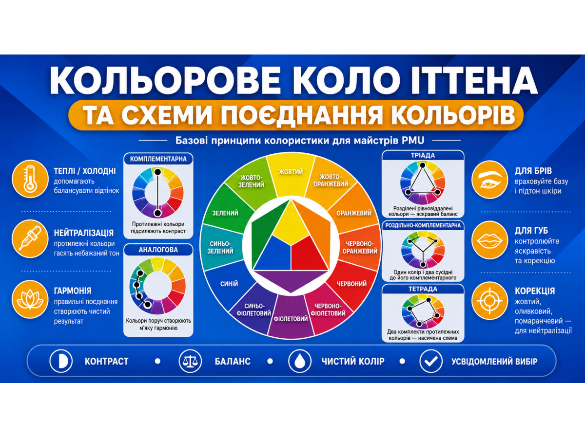
In PMU, knowledge of the color wheel is especially important. Permanent makeup is not color work on paper or a screen. Pigment is implanted into the skin, interacts with the natural undertone, heals, changes over time, and may produce unwanted shades.
If an artist does not understand basic color theory, it becomes difficult to choose the right pigment for brows, lips, or eyelids, neutralize old PMU, or correct gray, red, purple, or orange residue.
Itten’s color wheel helps reveal the logic: which colors enhance each other, which create contrast, which neutralize unwanted tones, and why the same pigment can look different on different clients.
What is Itten’s color wheel?
Johannes Itten was an artist, color theorist, and Bauhaus teacher. His color wheel became one of the best-known models for studying color harmony. The wheel is based on primary, secondary, and tertiary colors.
Primary colors are red, yellow, and blue. In the classic artistic model, they cannot be created by mixing other colors. They form the foundation of the wheel.
Secondary colors are created by mixing primary colors:
- red + yellow = orange;
- yellow + blue = green;
- blue + red = violet.
Tertiary colors appear when a primary color is mixed with a neighboring secondary color. Examples include yellow-orange, red-orange, red-violet, blue-violet, blue-green, and yellow-green.
As a result, the wheel shows colors arranged not randomly, but according to a clear logic. Neighboring shades transition softly into each other, while opposite colors create contrast and can neutralize one another.
Why a PMU artist needs to understand the color wheel
At first glance, it may seem that a permanent makeup artist only needs to know ready-made pigment shades: this one for blondes, this one for brunettes, this one for lips, and this one for correction. In reality, it is more complex.
The client’s skin has its own undertone. Old pigment may be gray, red, orange, purple, or blue. Lips may be pale, cool, lilac, brownish, or naturally bright.
Brows can heal warmer or cooler depending on skin type, implantation depth, pigment composition, and aftercare.
The color wheel helps the artist avoid guessing. If brows after old PMU have turned gray or blue, the artist understands that a warm corrective shade may be needed. If the residue is too orange, it should not be covered with an even warmer color without analysis. If the lips are cool, a warm correction may be needed before achieving a beautiful pink result.
Color theory does not replace practice, but it gives a foundation for decision-making.
Warm and cool colors
One of the basic topics in the color wheel is color temperature. Colors are usually divided into warm and cool groups.
Warm colors include yellow, orange, red, and their variations. They are associated with sun, warmth, energy, blush, and golden tones.
Cool colors include blue, light blue, violet, blue-green, and their variations. They are associated with coolness, shadow, depth, and a cool undertone.
In PMU, temperature is especially important when choosing pigments. For example, a brown that is too cool may heal gray on brows. A brown that is too warm may leave a reddish or orange residue.
On lips, a cool natural undertone may “eat” a beautiful pink color, so the healed result may not look as fresh as expected.
It is important to understand that warm and cool are not absolute concepts. One brown may be warm compared to another, but neutral compared to a third. That is why the artist should look not only at the pigment name, but at its real undertone and behavior after healing.
Complementary color scheme
Complementary colors are colors located opposite each other on the color wheel. For example:
- red and green;
- yellow and violet;
- blue and orange.
These pairs create strong contrast. In design, they are used to make an image bright and expressive. In PMU color theory, this scheme is especially important for neutralizing unwanted tones.
If old PMU residue contains blue or gray tones, warm orange or peach correctors are often used. If the shade leans purple, a yellow or warm corrector may be needed. If redness is present, green theoretically neutralizes it, but in PMU such decisions require great caution and an understanding of depth, saturation, and skin condition.
The main rule: a complementary color does not always need to be used in its pure form. Often, a soft corrective addition is enough. If too much corrector is used, a new problem may appear instead of fixing the old one.
Analogous color scheme
An analogous color scheme is a combination of colors located next to each other on the color wheel. For example:
- yellow, yellow-orange, orange;
- red, red-violet, violet;
- blue, blue-green, green.
These combinations look soft, harmonious, and natural. In design, they create a calm palette without sharp contrast.
In permanent makeup, analogous logic helps when choosing lip shades. For example, a nude palette can be built on close warm shades: peach, coral, and pink-beige.
For a cooler effect, soft pink and berry directions can be used, but always with consideration of the natural lip color.
For brows, the analogous scheme appears in the selection of similar brown shades: light taupe, neutral brown, and soft chocolate. This approach helps create a natural result without sharp color jumps.
Triadic color scheme
A triadic color scheme is a combination of three colors located at equal distance from each other on the color wheel. A classic example is red, yellow, and blue. Another option is orange, green, and violet.
In design, the triadic scheme creates a lively, balanced, and contrasting palette. But in PMU, it is not used literally as “three colors in one procedure.” The principle of balance is more important.
For example, during a complex correction of old PMU, the artist may see several tones at once: gray-blue residue in the brows, warm client skin, and the desired neutral brown result. The decision requires balance between correction, the target color, and how the skin will affect the healed result.
The triadic scheme helps the artist think more broadly: not only “which color should I add,” but how the entire system of shades will look after healing.
Split-complementary color scheme
A split-complementary scheme is similar to a complementary scheme, but instead of one opposite color, two neighboring colors are used. For example, if the main color is blue, then instead of pure orange, yellow-orange and red-orange can be considered.
In design, this scheme gives contrast, but looks softer than direct opposition. In PMU, it can be compared to a more delicate correction.
Instead of a strong pure corrector, the artist can choose a softer warm shade that does not cover the color harshly, but gently shifts it in the right direction.
This approach is especially useful for beginners. It teaches artists not to use correctors too aggressively. Sometimes the task is not to “repaint” the old shade, but to softly balance it.
Monochromatic color scheme
A monochromatic scheme is built on one color, but in different variations of lightness, saturation, and depth. For example, light brown, medium brown, and dark brown. Or soft pink, more saturated pink, and deep berry.
In PMU, monochromatic logic is very practical. For brows, an artist may have several levels of brown: for blondes, taupes, brunettes, and darker brunettes. This is not a chaotic palette, but a clear system.
For lips, a monochromatic scheme helps create different versions of one direction: natural nude, fresher pink, or saturated berry. It is easier for the client to choose the result, and easier for the artist to explain the difference between shades.
A monochromatic palette is especially convenient for beginners. It reduces the risk of random mixing and helps the artist understand faster how shades behave in the skin.
Color saturation and lightness
The color wheel shows relationships between shades, but for PMU this is not enough. Saturation and lightness must also be considered.
Saturation is the intensity of a color. The more saturated the color, the brighter and more active it is. A less saturated color looks softer, calmer, and closer to natural.
Lightness is how light or dark a color is. Even a shade with the correct temperature may be too dark for the client. For example, neutral brown may be beautiful on its own, but look too harsh on light skin and light hair.
In PMU, it is important to choose not only “warm or cool,” but also “how dark” and “how saturated.” This is especially important for brows: a mistake in lightness is often more visible than a small mistake in undertone.
How skin color affects pigment
PMU pigment does not sit on top of the skin like decorative cosmetics. It is located inside the skin, which means the natural tissue shade affects the final color. A client may have a cool, warm, neutral, olive, pink, or yellowish undertone.
On cool skin, some browns may heal more gray. On warm skin, the same shade may look softer or warmer. On lips, natural bluishness can change a pink or nude pigment. On olive skin, some shades may look more muted.
That is why an artist should not choose pigment only from a photo. It is necessary to evaluate the client’s skin, old residue, natural hair color, desired result, and healed results from similar cases.
The color wheel and correction of old PMU
Correction of old PMU is one of the situations where the color wheel is especially useful. Old brows may be gray, blue, red, orange, purple, or too dark. Lips may have cool, brown, or uneven residue.
But it is important to understand: not every old PMU can be corrected with new pigment. If the color is too dense, deep, or dark, removal or lightening may be needed first. Trying to cover everything with a new color often leads to an even more complicated result.
The color wheel helps determine the correction direction, but it does not replace diagnosis. The artist should assess the depth of the old pigment, density, skin condition, shape, age of the work, and client expectations.
Common mistakes in working with color
The first mistake is choosing pigment only by name. “Brown,” “Chocolate,” “Blond,” “Nude,” or “Rose” may have different undertones across different brands.
The second mistake is not considering healing. Fresh color is almost always brighter, warmer, or more saturated than the result after the skin recovers.
The third mistake is using too much corrector. Neutralization requires precision. If too much warm shade is added, gray brows can become reddish. If lips are corrected too aggressively, the result may heal patchy.
The fourth mistake is mixing pigments without understanding the logic. Mixing should not be random, but intentional: the artist should understand why each shade is being added.
The fifth mistake is not keeping a photo archive of healed work. Without it, it is impossible to understand how a specific pigment behaves in your technique.
Practical checklist for the artist
Before choosing a color, ask yourself several questions:
- what natural undertone the client’s skin has;
- whether old pigment is present;
- what shade should be achieved after healing;
- whether the color needs to be intensified, softened, or neutralized;
- which color on the wheel is opposite the unwanted shade;
- how saturated the result should be;
- whether the chosen shade may be too dark;
- whether you have healed examples of similar cases;
- whether a corrector is needed or old work should be lightened first;
- whether you can explain to the client why you chose this exact color.
This approach helps move away from random choices and work more professionally.
Conclusion
Itten’s color wheel is not theory “for artists,” but a practical tool for a permanent makeup artist. It helps explain why colors look different, which shades work together, which create contrast, and which can neutralize unwanted residue.
The complementary scheme helps with correction. The analogous scheme helps create soft natural combinations. The monochromatic scheme helps build a convenient brow and lip palette. Triadic and split-complementary schemes teach balance and prevent overly direct color decisions.
A good artist does not choose pigment only by name or a beautiful swatch. They analyze the skin, undertone, old residue, technique, healing, and desired result.
This is how the color wheel turns from a learning diagram into a working tool that helps create permanent makeup that is beautiful, harmonious, and predictable.